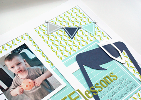
Hi! It's Kelly here today to share with you a layout combining the Forever Sassy and Hoo's Sweet collections. Keeping the color scheme more masculine, I pulled blue and green elements from them both. The colors were a perfect match for my boy themed page.
I thought it would be fun to create a grid design using a mat that I took out of an 8.5x11 document frame. I originally set one box aside for the photo, one for the title, one for an embellishment cluster, and one for the journaling. But, after I had it all laid out, I started moving things around. I feel like the end result draws the eye across the page a little bit better.
Combining these two collections was effortless, as the colors were a perfect match. Thanks for stopping by today!
Supplies
Hoo's Sweet - Little Petals, stickers
Forever Sassy - Cheeky Snippets, stickers, Sundries, Assorted Overlays
Chalet - Sundries
Basics - Sundries
Kelly


No comments:
Post a Comment