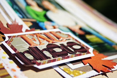
Welcome Melissa Mann to our 2012 design team! Melissa created this 8.5 x 11 fall layout using papers and embellishments from the Homestead collection.
One of our favorite things about this layout is the way she used scraps of paper. They bring a lot of different colors and textures into the layout. What a smart way to use scraps!
To make a traditional font more quirky, Melissa turned the "o"s sideways and combined it with letters from a puff sticker sheet.
Happy weekend, everyone!


2 comments:
I really like the layers on this page and the colors are GORGEOUS!!
This border is such a fun way to mix patterned papers without being overpowering! Beautiful page :)
Post a Comment